Link to RIT Event Finder's Webpage - https://riteventfinder.wordpress.com/
Timeline:
10 Weeks
Team Size
4 HCI Students
Summary
As part of a class project, my team designed low and high fidelity prototypes for an event aggregation app for Rochester Institute of Technology on-site students to find all kinds of interesting campus events nearest to their location, and invite friends to join them. This app would also allow students to navigate and find events happening around them in real time.
Our team decided to create a one-stop platform for RIT students and staff to find and attend events happening on campus, to replace the multiple platforms and applications that exist currently. Based on informally asking people we knew on campus, we realised this was an interesting problem area. After a formal series of interviews of the various stakeholders on campus, we refined our approach to address the following key issues:
In-Campus Navigation
Last-Minute Availability of Free Time
Forgetting/Missing Events due to Various Reasons
Finding Relevant Events
The final prototype (best described as a mid-to-high level prototype), tries to accommodate solutions to each of the above problems, through the following features:
The LiveMap, which allows users to find events happening near them in real time.
A fully customisable reminder and notification system, linked to one’s Google Calendar.
Tag-based filter and search options.
The prototypes were developed over the course of four months. The process involved collecting data through user interviews, affinity diagramming to identify key user needs, behaviour mapping to identify pain points and use cases, developing user personas, and finally prototyping with each persona's story in mind.
The final artefacts included all the materials from our user research, as well as a high fidelity prototype designed in InVision Studio.
Motivation:
At the time of designing Event Finder, there was a need to keep tabs on multiple inboxes across multiple apps, since different clubs and departments had their own platforms for communicating event details. This led to many students missing out on potentially interesting and beneficial events taking place on campus.
Additionally, navigating around campus and finding event locations was particularly difficult for students who were unfamiliar with the campus. Due to this issue, turnout for events on campus seemed to be restricted to students who were familiar with the campus, part of the organizing club, or both.
To address the issue of low turnout, and to enable all students to discover interesting events, our team proposed Event Finder, using which any student would be able to discover academic, career-related, and extracurricular events all in one place. We included a LiveMap feature to update and display current events around the student's location, which would update in real time as they moved around.
Process:
User Interviews:
We started with identifying key stakeholders in the management and attendance of campus events. We wanted to include a group that was diverse, and representative of the population at RIT. In this pursuit, we spoke to 12 potential stakeholders, including students, alumni, faculty, and administrative staff.
Through these interviews, we found out:
1. How different stakeholders found out about events on campus,
2. What kinds of events different stakeholders were interested in,
3. What difficulties were associated with finding and attending interesting events,
4. What administrative challenges existed in the organization and conducting of events, and
5. What stakeholders would ideally like to see from a campus-events aggregator.
I interviewed two people, and acted as a scribe for two more interviews. The questions were a team effort.
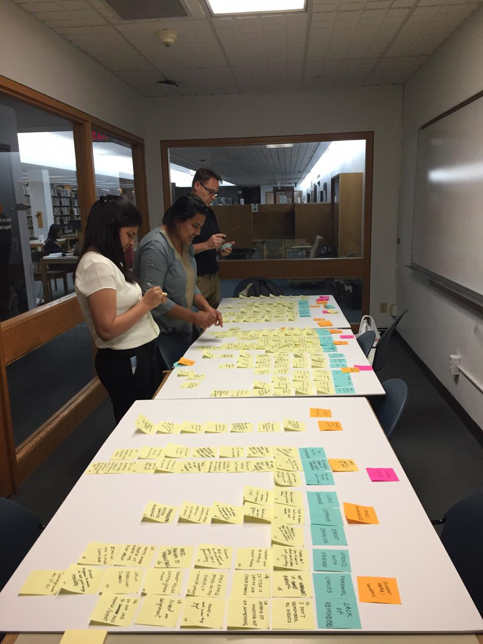
Affinity Diagrams:
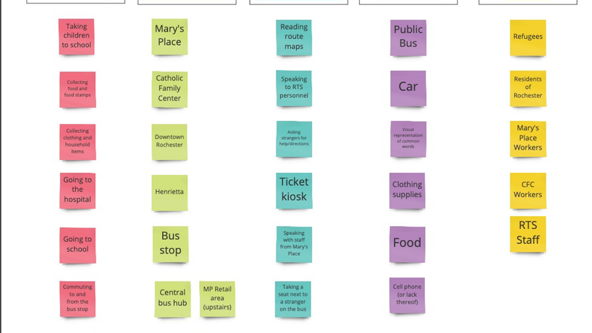
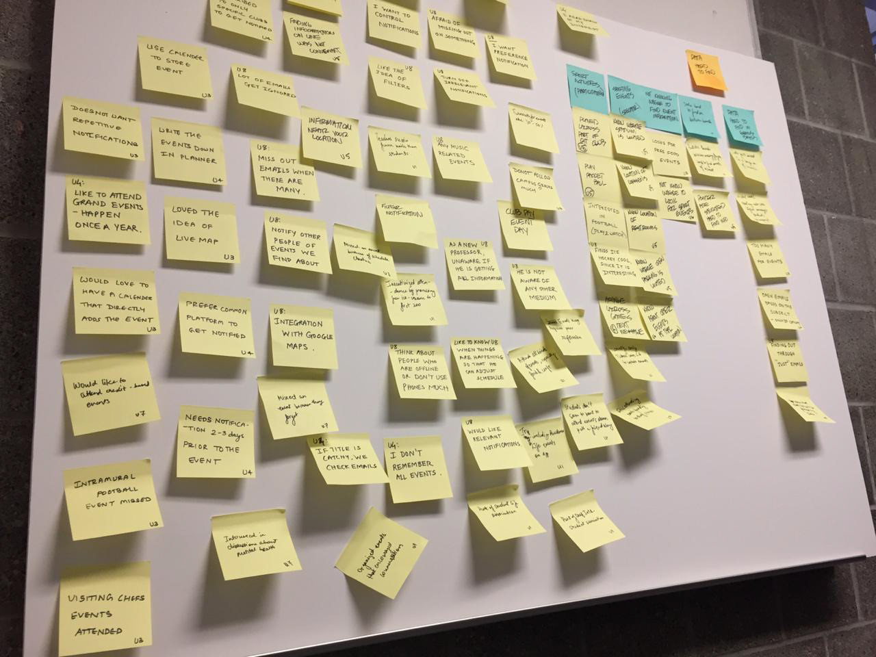
A picture of our affinity diagram. The top-level notes (pink) were Campus Wide Events, Low Turnout, Missing Events, Configurable/Editable Event Notification and Search, Single Mode of Receiving Information.
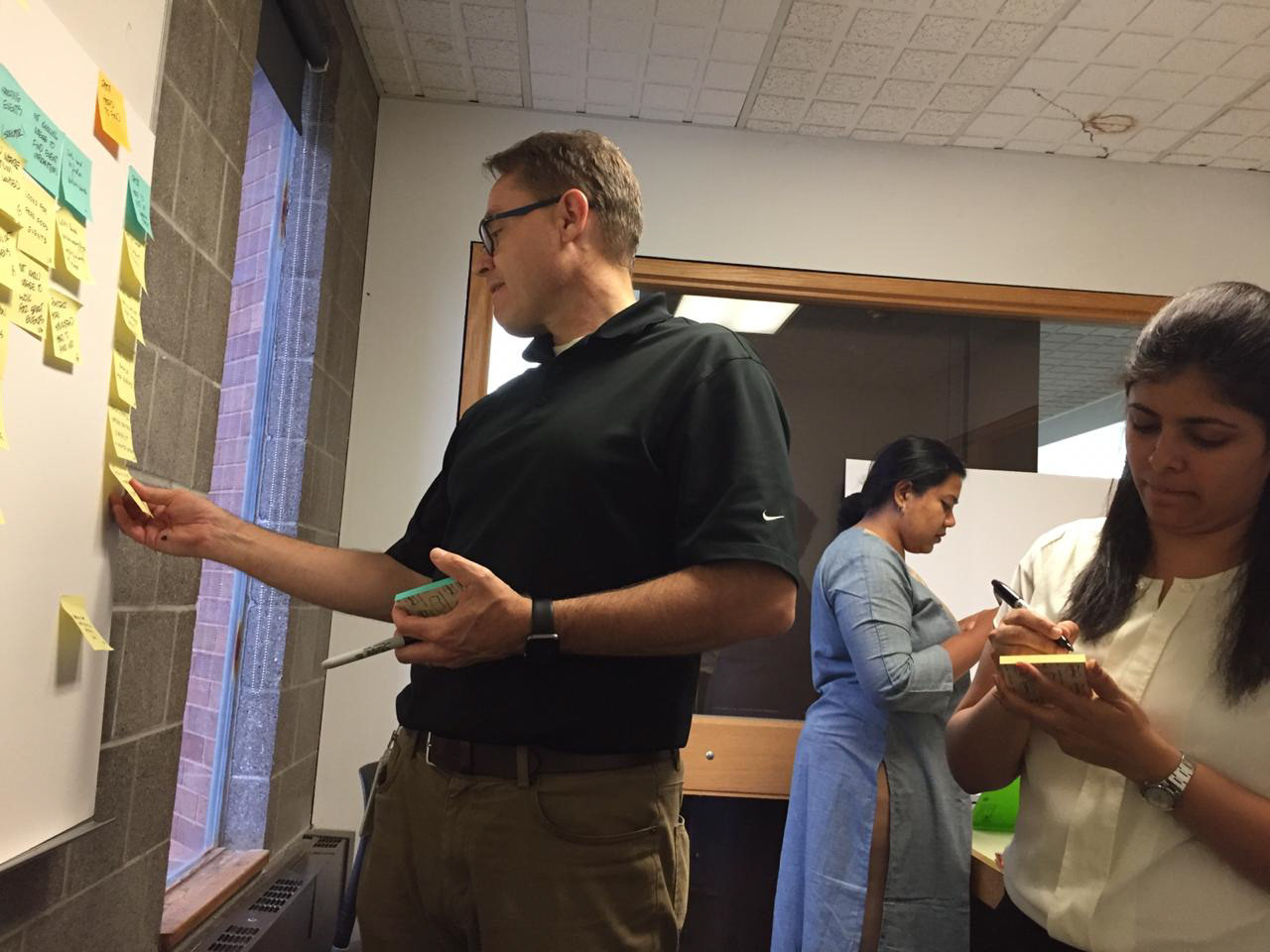
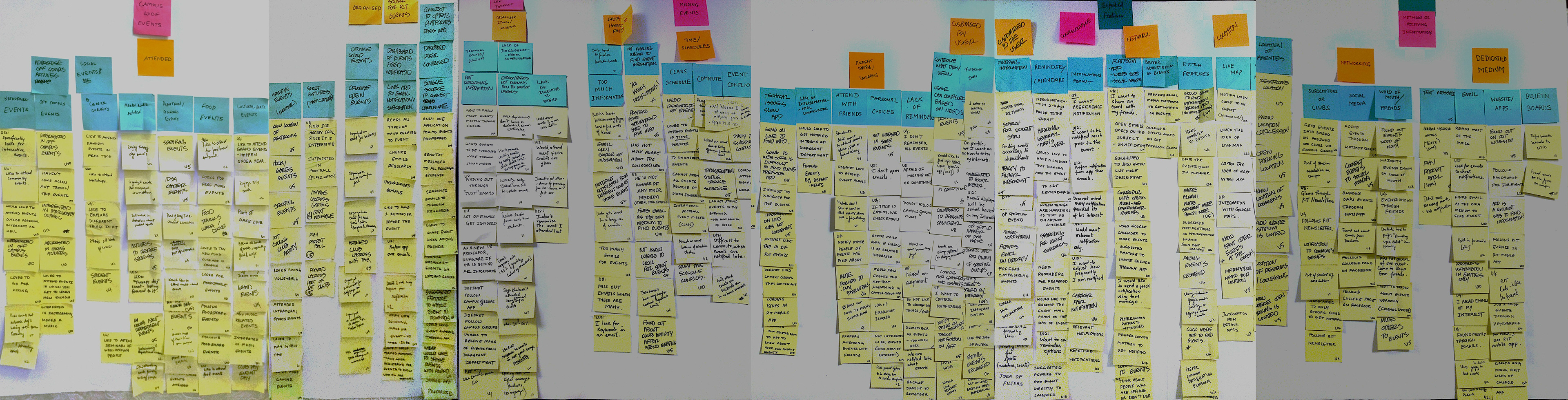
Pictures of the team, taken during the affinity diagramming process.
We analysed all the data from the interviews using an affinity diagram. We used this method to sort through the rich qualitative data we had obtained, especially since we had users with varying stakes and needs. In the images above, you can see our final affinity diagram, and some pictures taken while we were working on it.
The major insights from the analysed data were as follows:
1. Information about campus events is hard to find. There needs to be a single location to access information.
2. Users worry that they are not finding out about events they could be attending.
3. Information needs to be easily accessible wherever the user is located.
4. Users want to configure the way they see and access information.
5. Users want to better manage scheduling between classes, activities and events.
6. Users want to network with others in finding, sharing and attending events.
7. Users want to link information from different platforms for accessing information about events.
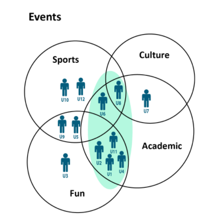
Behavioural Mapping:
My teammate Karl and I developed behavioural maps using the variables we identified using our Affinity Diagram's top-level insights. Upon graphing the behavioural variables, we noticed a few distinct patterns:
Students seem to want a platform where they can easily schedule events around their classes and other academic commitments.
Sports and sporting events are popular on campus. (Something we knew anecdotally, but it was kind of like a good yardstick for the accuracy – or at least integrity – of our data and representations.)
1. Events –
Cultural (Arts, Performance Art, Religious/Festivals, Ethnic Traditional, etc.),
Fun (Freebies, Free Food, Crafts, Boardgames, etc.),
Sports (Playing and/or Watching matches or tournaments),
Academic (Networking, Career Fairs, Department Townhalls, Guest Lectures, etc.).
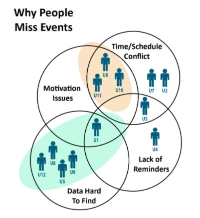
2. Reasons for missing events –
Data about events can be hard to find,
There may be schedule or timing clashes between events,
Attendees may lack the motivation to attend a particular event, due to a lack of company or other social/mood dependent factors,
Lack of Reminders.
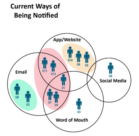
3. Existing media of receiving event information –
Social Media,
Word of Mouth,
Emails,
Application/Website.
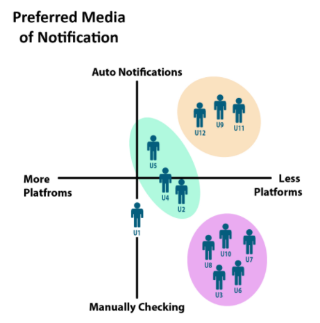
4. Preferred medium for notification –
More to Less number of platforms,
Automated notification frequency to Manually checking for information.
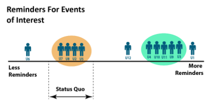
5. Reminders –
Less to More frequent.
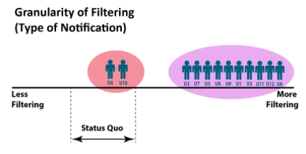
6. Filtering granularity –
Coarse to Fine-grained filtering of notifications.
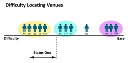
7. Difficulty locating event venues on campus –
Difficult to Easy.
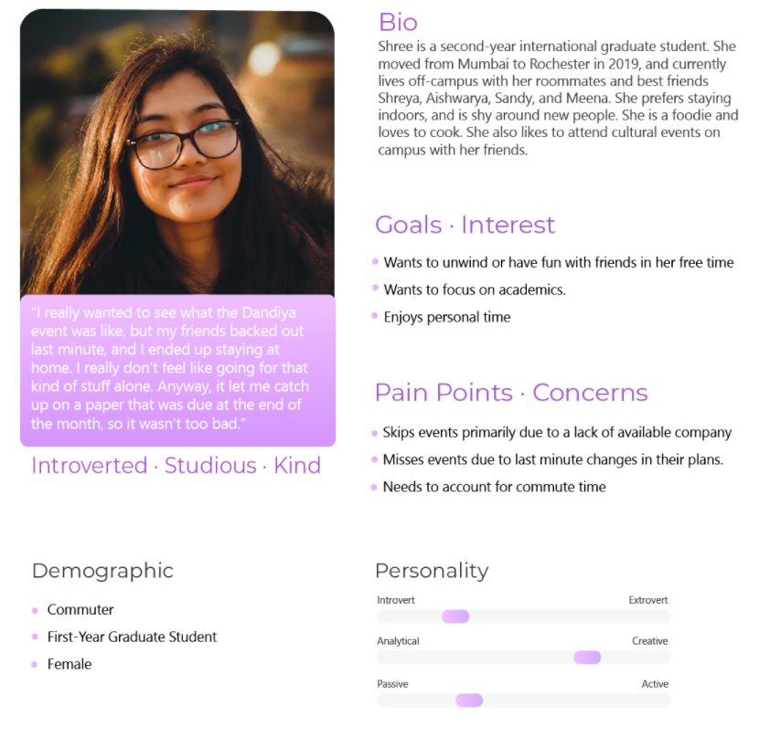
Personas:
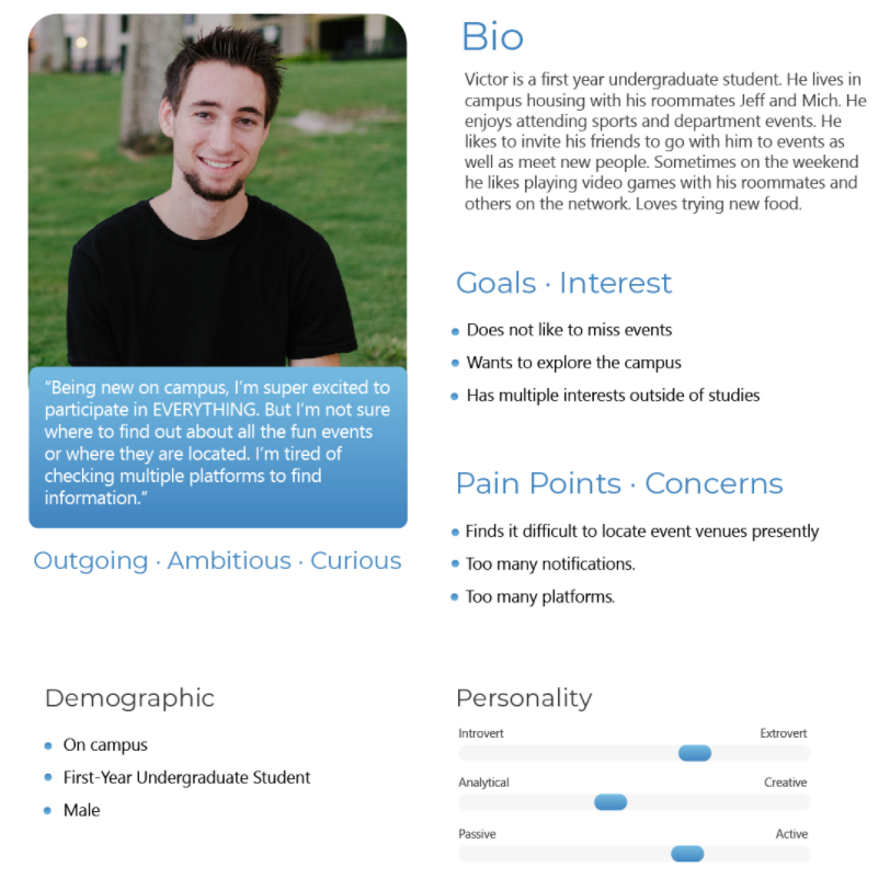
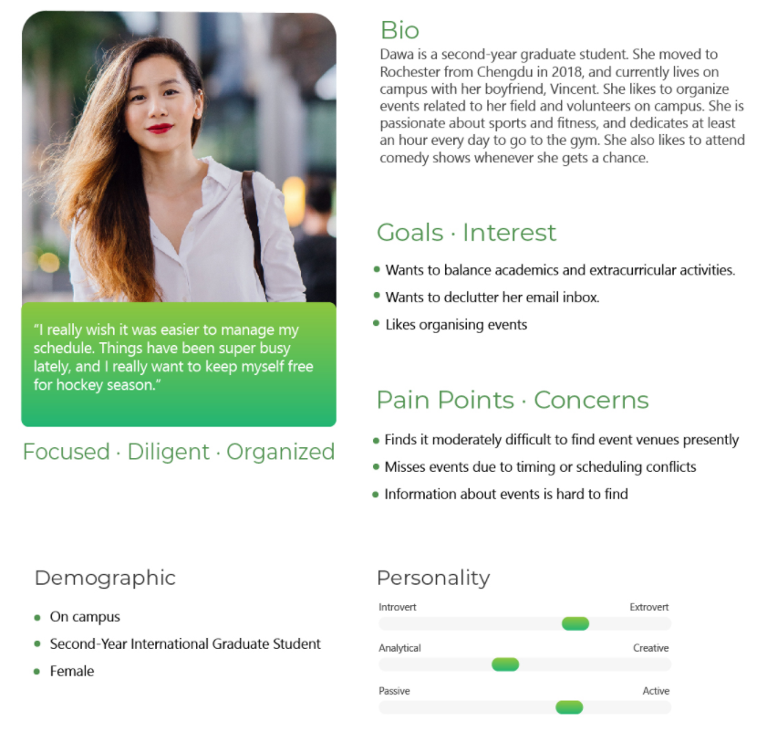
The behavioural variables gave us a lot of insight into our users' preferences, and distinct patterns emerged. We built three personas around these factors.
Scenarios:
We developed timelines and scenarios for each of our personas.
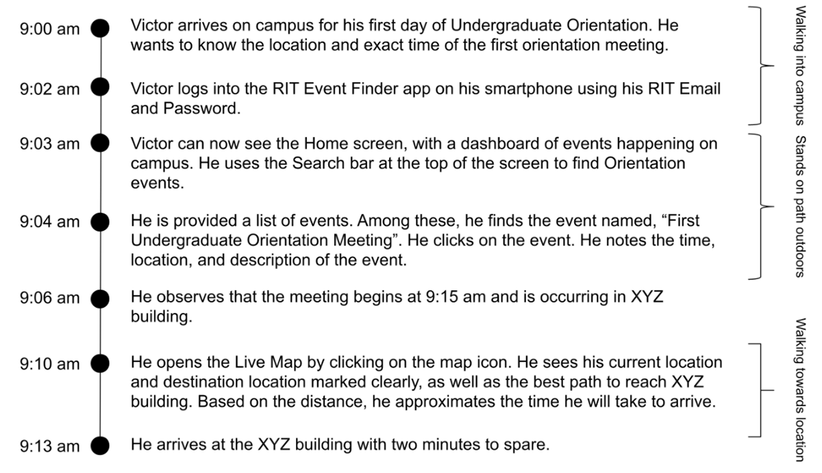
Scenario: New student navigating on campus.
Victor Lowe arrives on campus, on a Monday at 9:00 am, excited for his first day of college. He wants to make his way to his first orientation event, but he’s unsure about where and when exactly it will be held. He decides to try the RIT Event Finder app to find out.
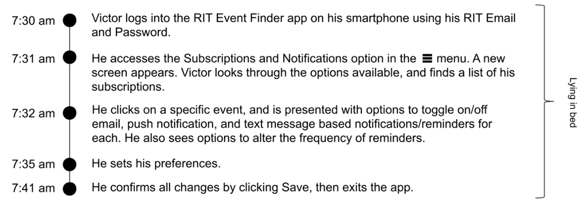
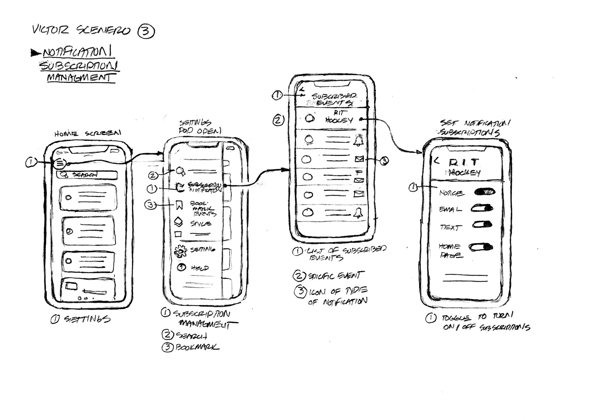
Scenario: Customising notifications and reminders
Bzzz, bzz… Bzzz, bzz! Victor startles awake and feels around for his phone. He sees the time and date: 7.25 am on a Saturday. After a brief look through the list of push notices, he groans in frustration as he realises his phone is flooded with notifications and emails about events. He decides to change his settings on the app, right then.
Scenario 4: Planning ahead and scheduling
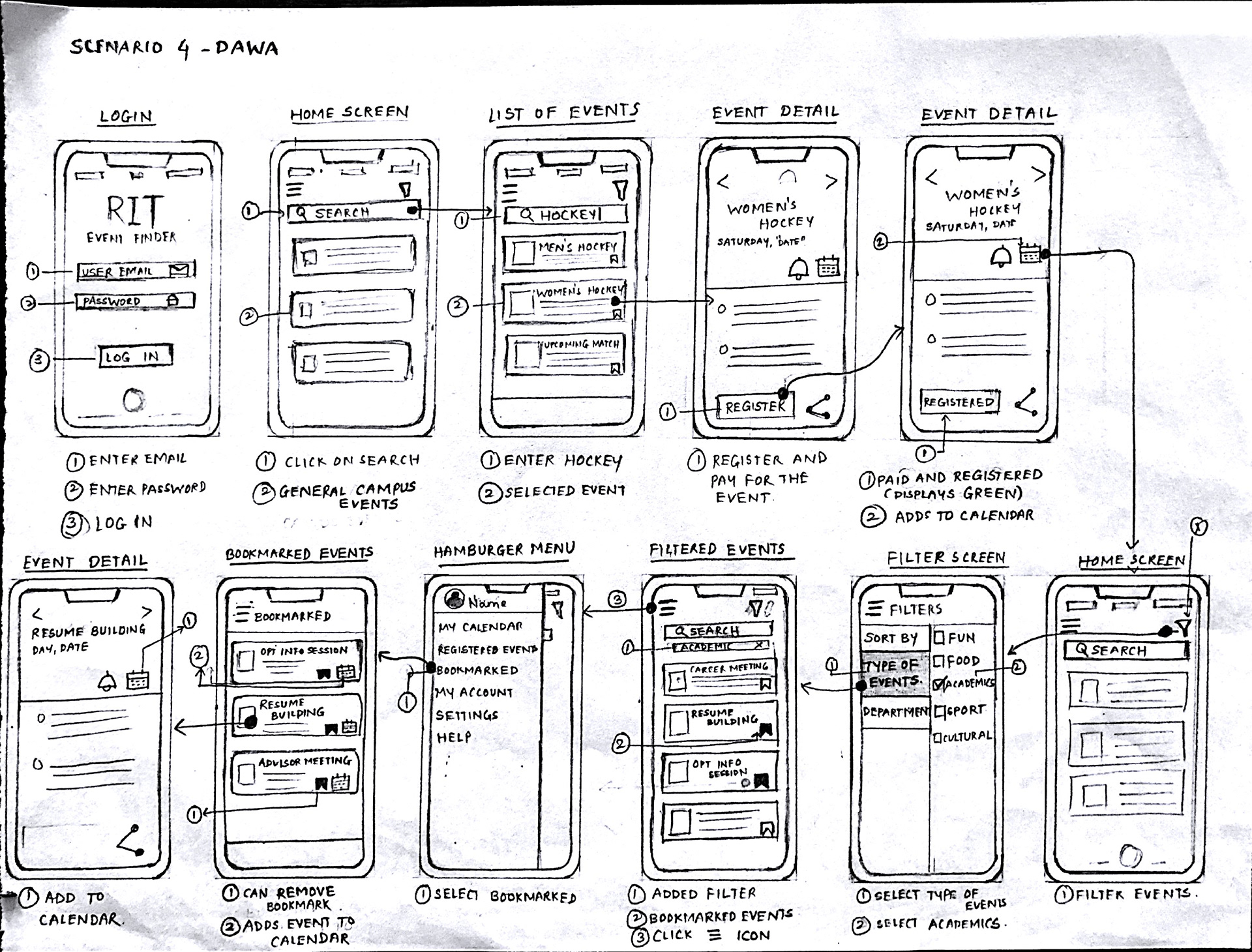
Dawa Wong settles into her desk chair on a Sunday evening, planning her schedule for the upcoming week. She and her boyfriend have been looking forward to watching RIT vs. Tufts the following weekend. She notices that apart from the weekend, she has some free time between classes, and wants to optimize it.

User Flow and App Functions:
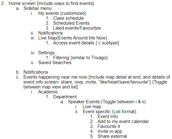
Low Fidelity Prototypes:
Based on the scenarios generated above, we developed some lo-fi prototypes. This version has been constructed with the following limitations and assumptions:
The user must be an RIT student or employee with an rit.edu/g.rit.edu email address.
We have accounted for the attendee users only, not organizers or administrators.
The Live Map constantly updates to display currently happening events around the users’ current location. It will be easily accessible at every step of the users’ journey on the app.
The static map (ie., sans the constantly updating ‘Events Near Me’) is simply the Live Map with strictly filtered criteria. Essentially, the static map will guide the user to their destination without ‘distractions’.
Interfacing with external platforms (Payment portals, social media, messaging apps, etc.) is secure and possible.
Prototype Based on Scenario 3:
One of the key frustrations is being unable to control exactly how and how often they were notified and/or reminded about events. Additionally, the present criteria for filtering are very broad, with respect to event type. We hope to amend that by giving users fine-grained control over the type, volume, and media of notifications/ reminders. It may be possible to accommodate administrative control by not allowing the average user to unsubscribe from critical or compulsory types of notifications, within reason.
Prototype Based on Scenario 4:
Organisation and time management are key to having a balanced life at RIT. Presently, the onus lies on the user to plan and schedule their time, even for compulsory or crucial department/ academic events. To prevent schedule clashes, easy reminders, we decided to include an in-app calendar/scheduler. Additionally, we offer a bookmark section to allow users to revisit potentially interesting events without the burden of RSVPing or a volley of unwanted notifications.
User Evaluations on the Lo-Fi Prototype:
We tested lo-fi screens to see what people would expect. These are the insights we obtained:
What worked:
Users felt that screens meet most expectations of function. They:
Thought that the LiveMap was an innovative feature, and that it made it easier to find and know what event was available where.
Liked that the map showed up first with the menu of events.
Liked the Bookmarks and Bookmark Toggle options.
Liked that reminders and notifications could be customised in the Hamburger Menu.
What needed to be changed:
When going into LiveMap mode, users expected to see a map, not a menu for a map.
When they selected the LiveMap for the event, they wanted more detailed information about the event.
When selecting an event in the LiveMap, they expected it to provide the location, the time of the event and more information about the event.
The Event Description Page could be better organised.
They wanted to know what others thought of the events.
High Fidelity Prototype:
https://xd.adobe.com/view/15d2bec8-50a7-4215-7c39-52ab5135d48b-63e3/
We received the following feedback after evaluating the high-fidelity prototype with users:
Users wanted to be able to scroll the menu up and down to review scheduled event in the LiveMap. (Design constraint)
Users expected the ability to cancel the selections or go back to the previous screen easily. (Design Constraint)